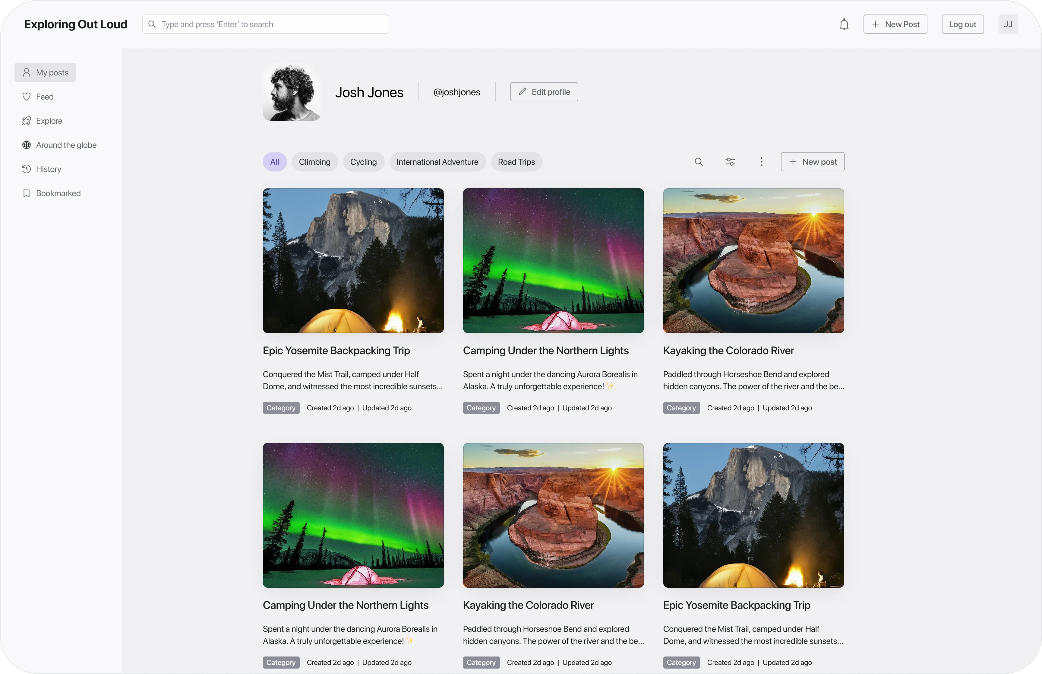
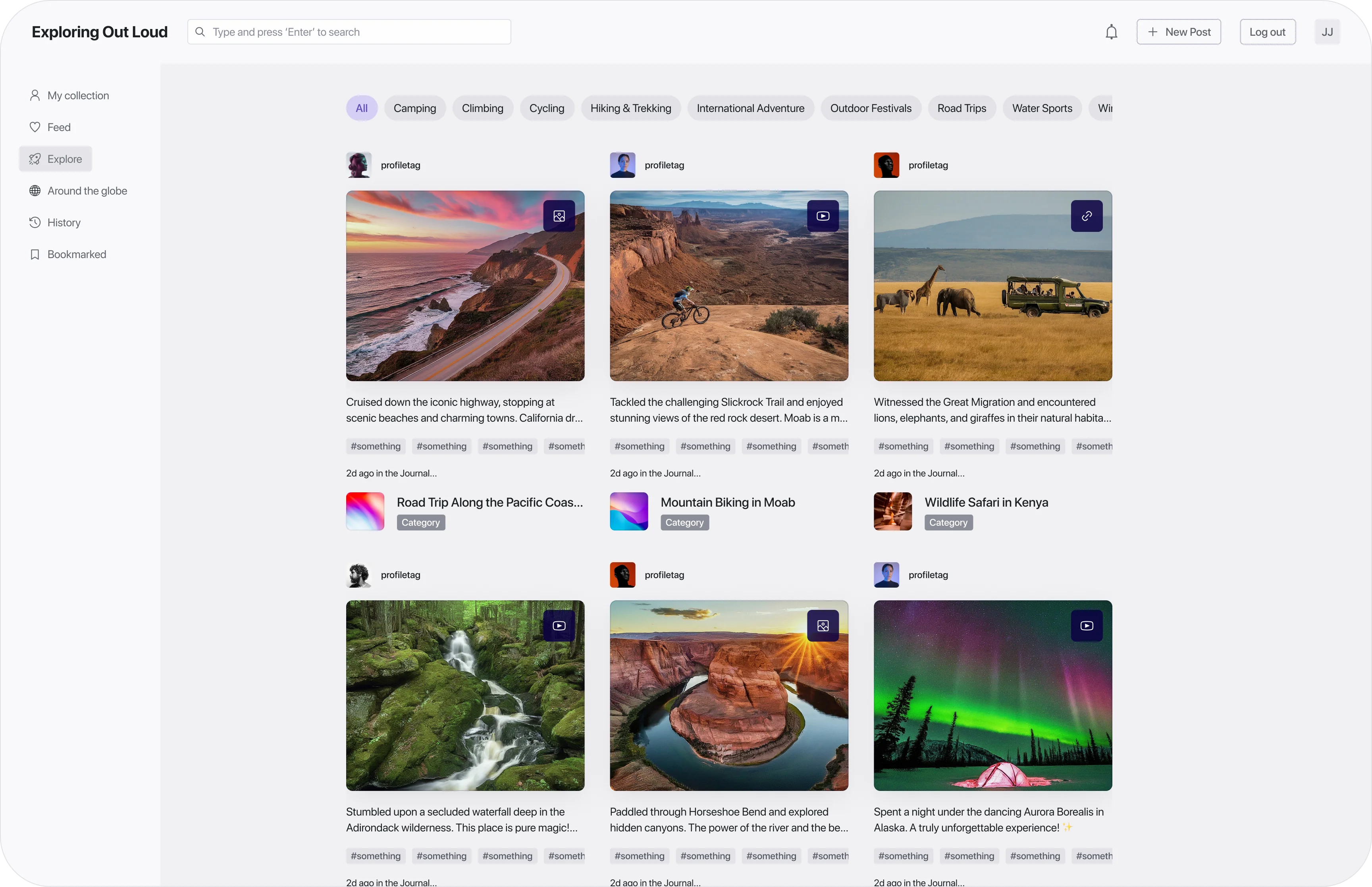
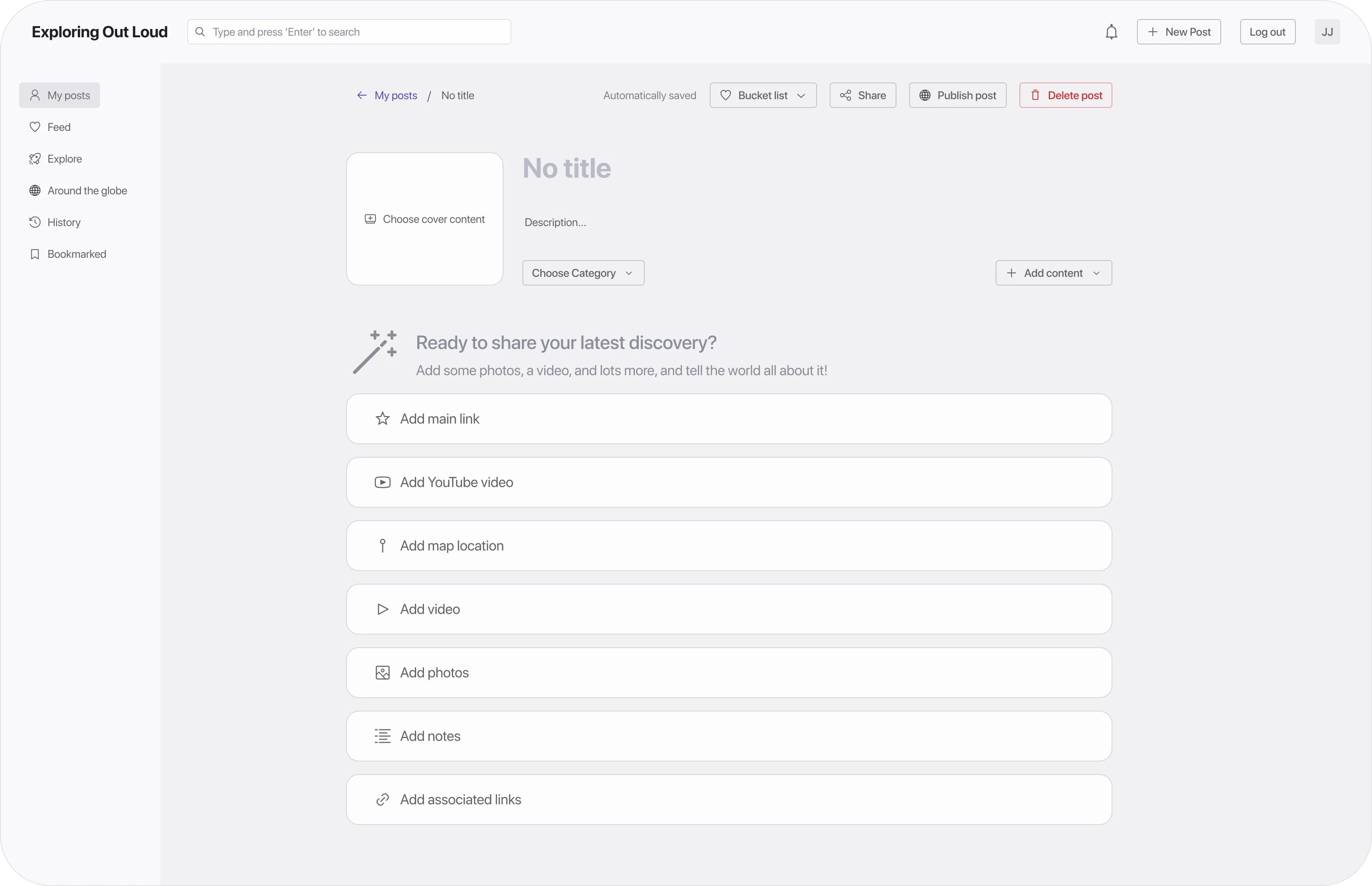
Three Weeks to Proof
Exploring Out Loud: Validating an Adventure-Sharing Platform in Three Weeks
Validating an adventure-sharing platform's MVP in three weeks, running product and design end to end.
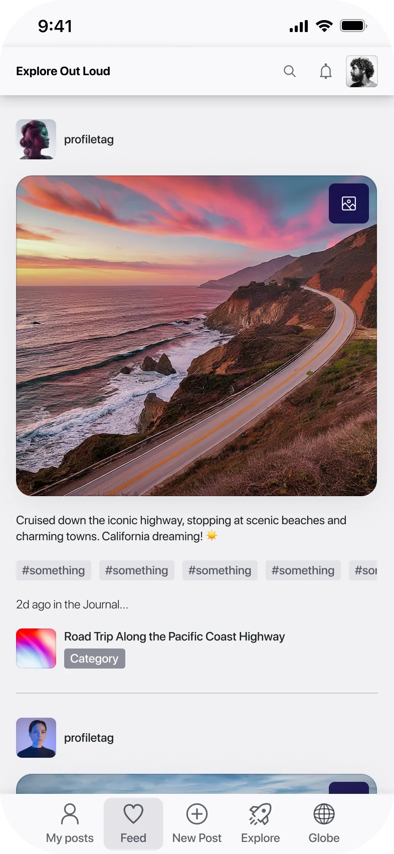
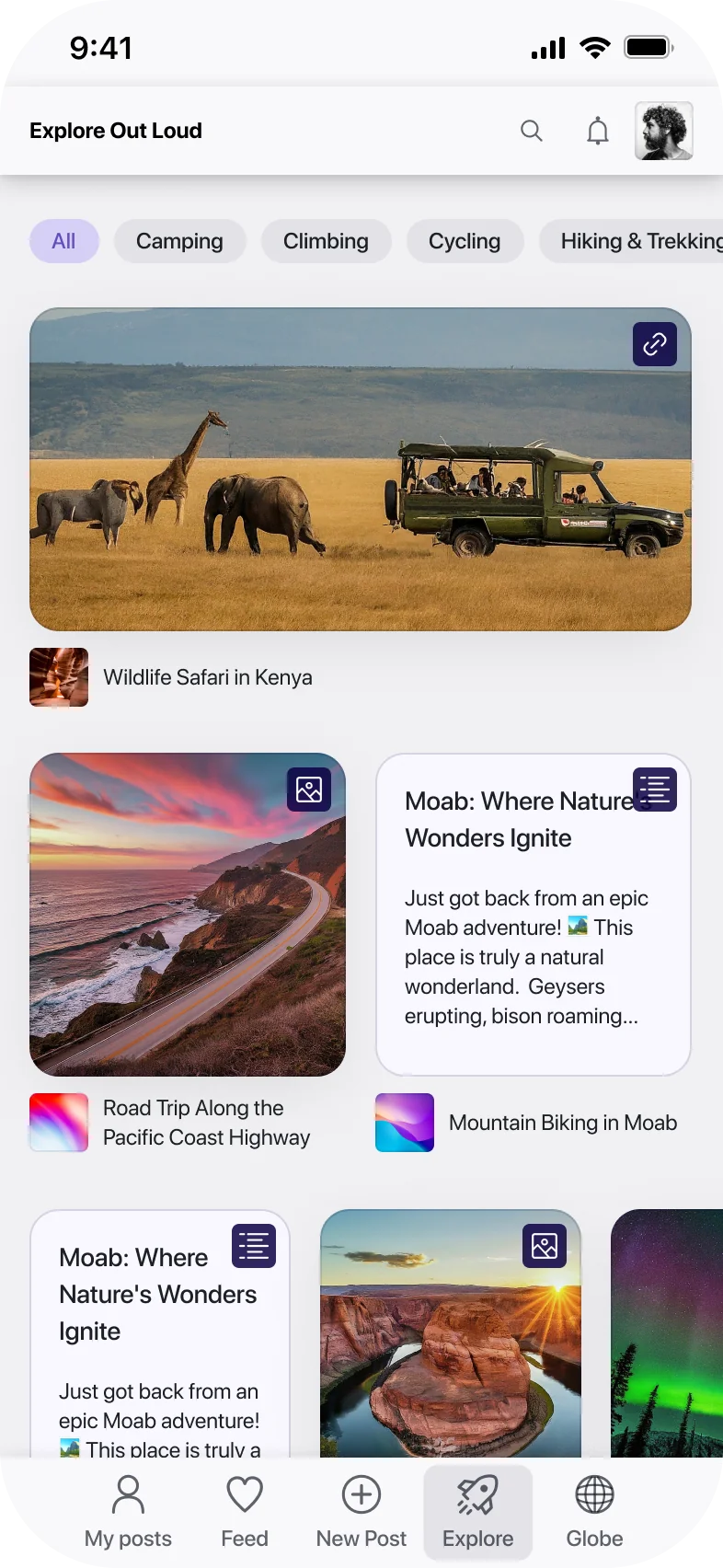
- Role
- Product Manager & Product Designer (dual role)
- Timeline
- 3-week proof of concept, against a typical ~2-month build
- Team
- 2 people — myself and one full-stack developer, at a_bit_forward
- Tools
- Radix UI, Git, React, Storybook; ChatGPT & Gemini for research
Overview
A client came to a_bit_forward, a product studio I co-founded with a developer partner, with an idea he'd carried for years: a platform for adventurers to document trips and share them with a community of explorers. He wanted to skip straight to an MVP. We proposed a proof of concept instead, scoped to test the idea before committing to a full build. I led product and design end to end.
Problem
Before designing anything, I walked the client through what an MVP is for: validating the core value proposition with the least effort, focused on features that attract early users and generate real feedback. Not a stripped-down final product, a test of a hypothesis.
We started from four value pillars sketched in an early session: organization, inspiration, sharing, community. I pushed to narrow that to two that could actually be tested in three weeks, efficiently organizing and accessing adventure-related content, and sharing experiences within a community of like-minded adventurers. Inspiration and pure discovery got parked for a later phase: real value, but not testable at MVP scope.
Decision
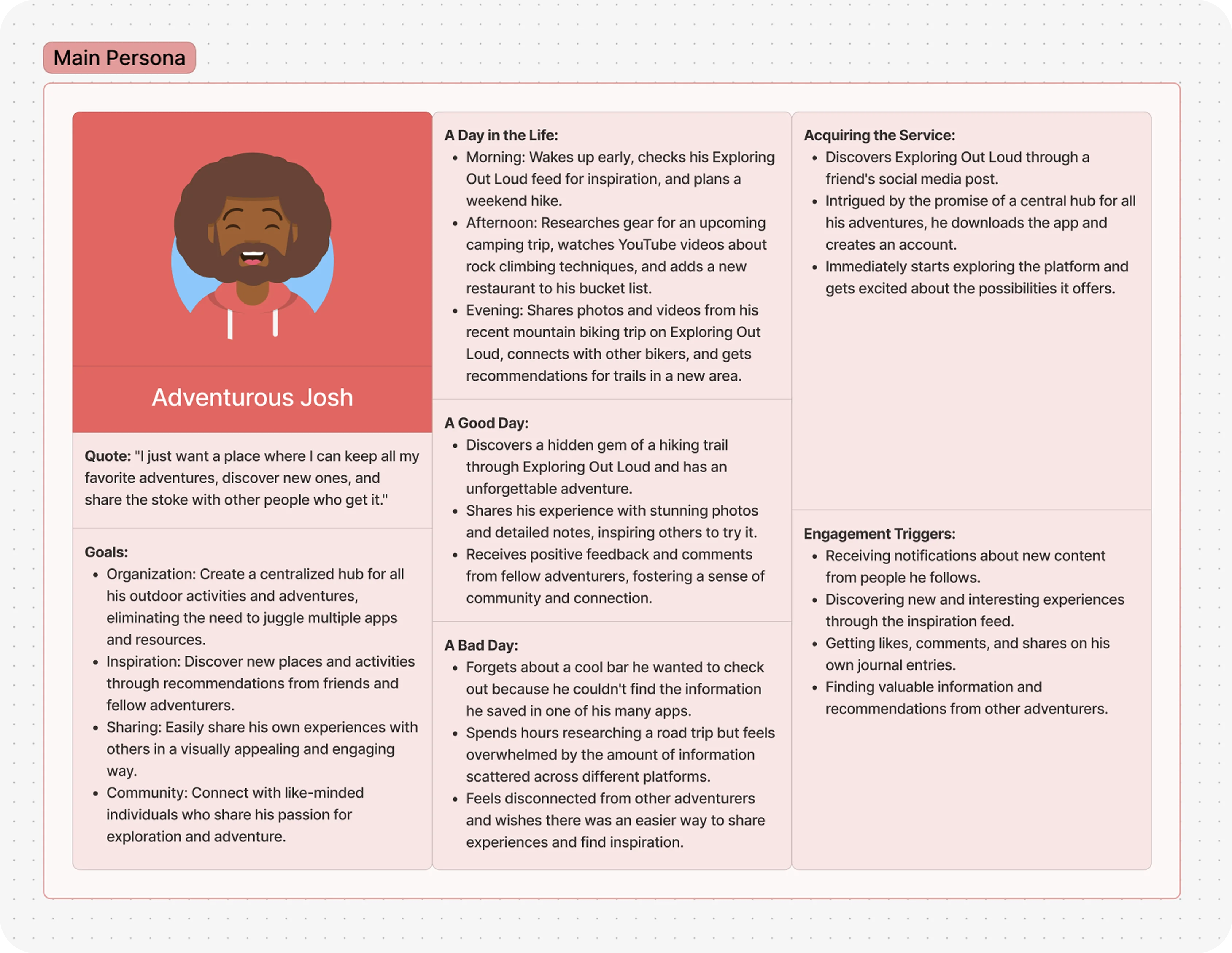
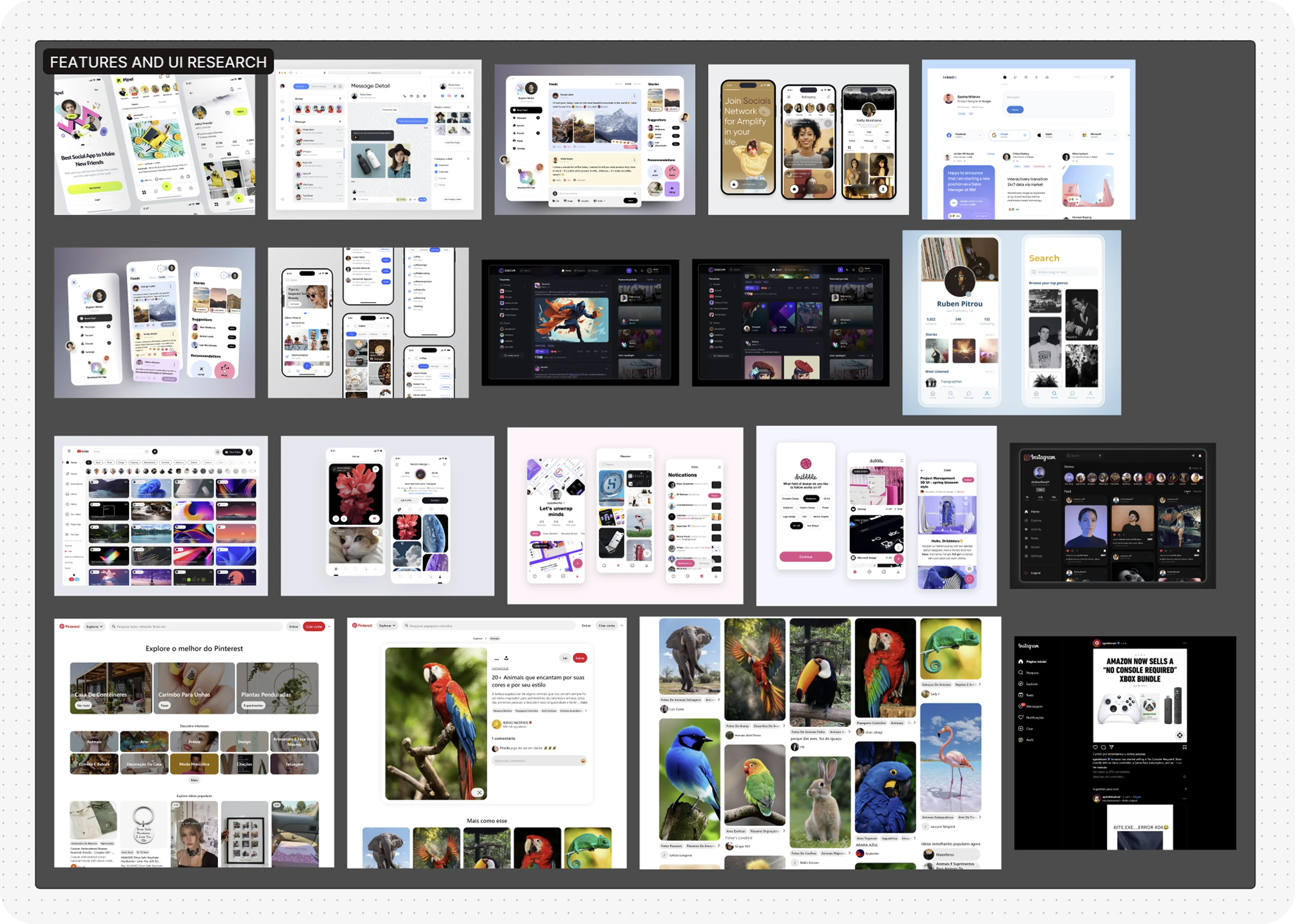
I built a persona, Adventurous Josh, at a day-in-the-life level of detail, not just demographics: juggling multiple apps to plan trips, losing track of things across all of them. I used him to pressure-test every feature decision that followed, does this help Josh on a bad day, or is it just a nice-to-have.
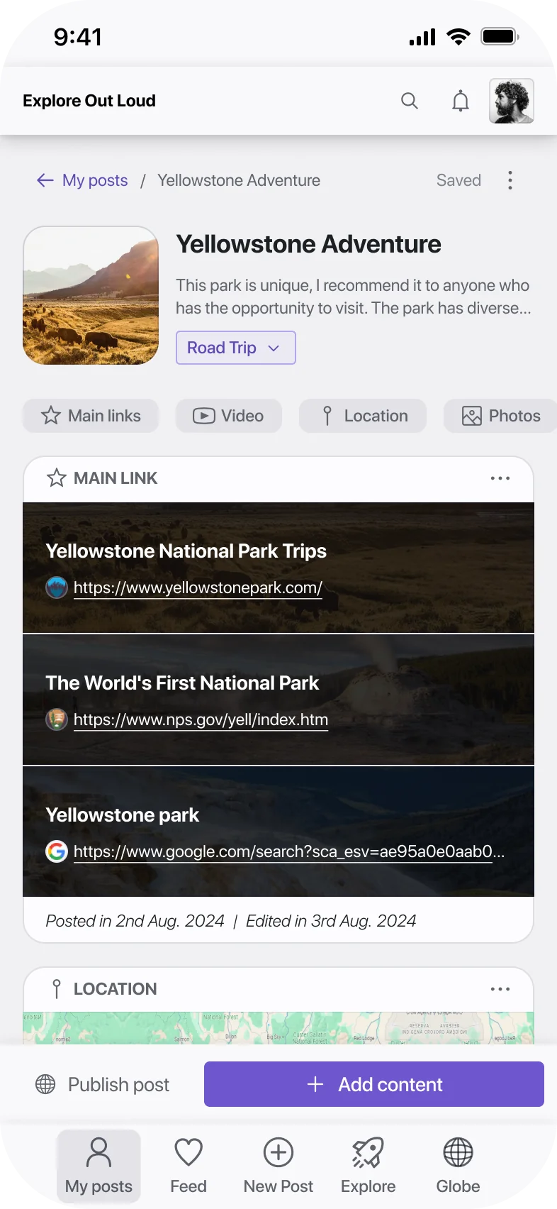
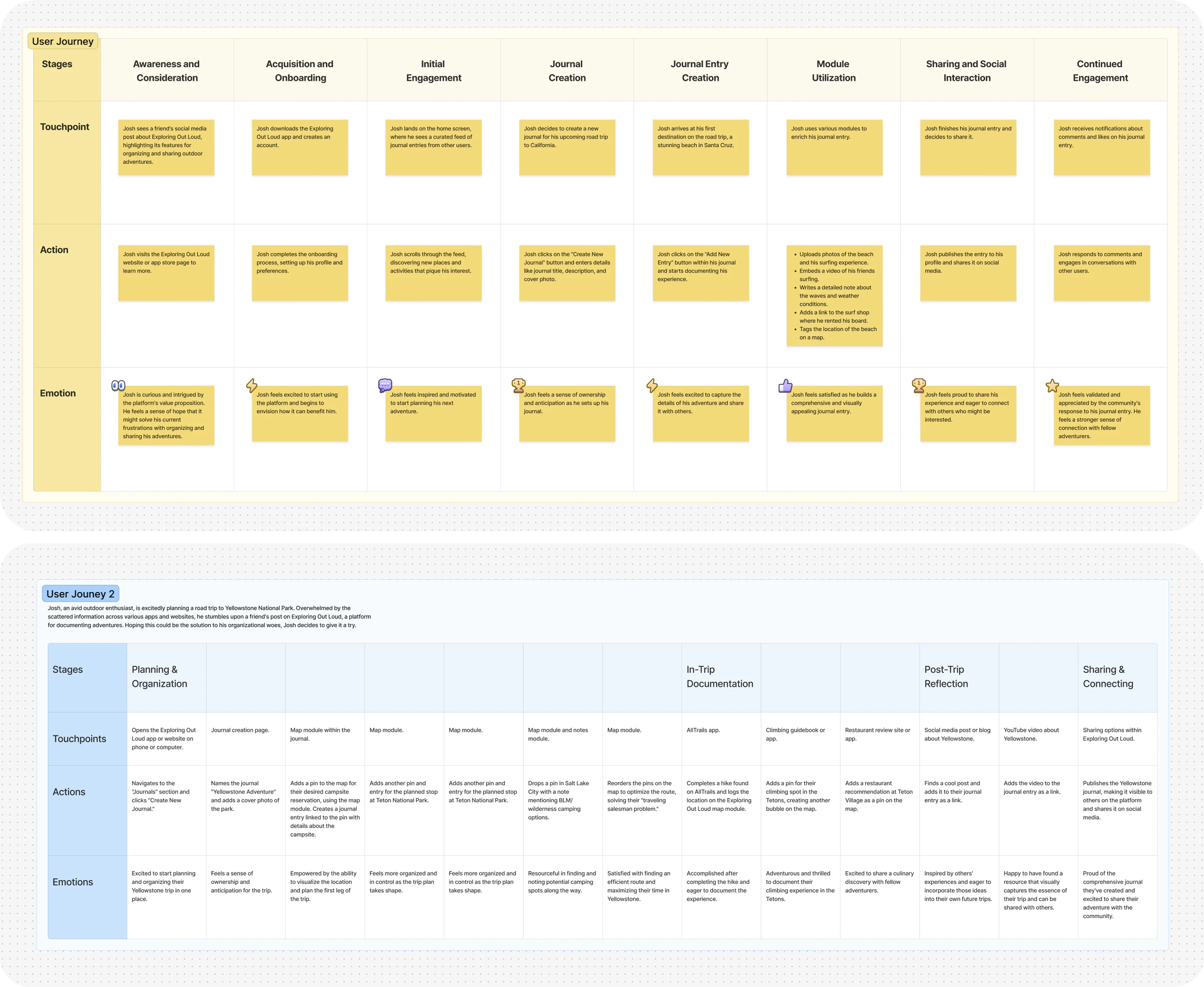
I mapped two user journeys. One tracked the full lifecycle, discovery through a friend's post, onboarding, creating a journal, adding content through modules, publishing, coming back for the social feedback loop. The other was a denser, scenario-based journey, a real trip to Yellowstone, showing exactly which touchpoints got used at each stage. The second mattered more for scoping: it showed the real value concentrated in plain, unglamorous moments, dropping a pin with a note about a campsite, logging a hike, reordering stops to solve a routing problem. Not the social feed. That shaped what I fought to keep in scope, and it's why I designed each journal entry as a modular container, a link block, embedded video, photos, a location module, one place to pull together everything already scattered across other channels.
Trade-off
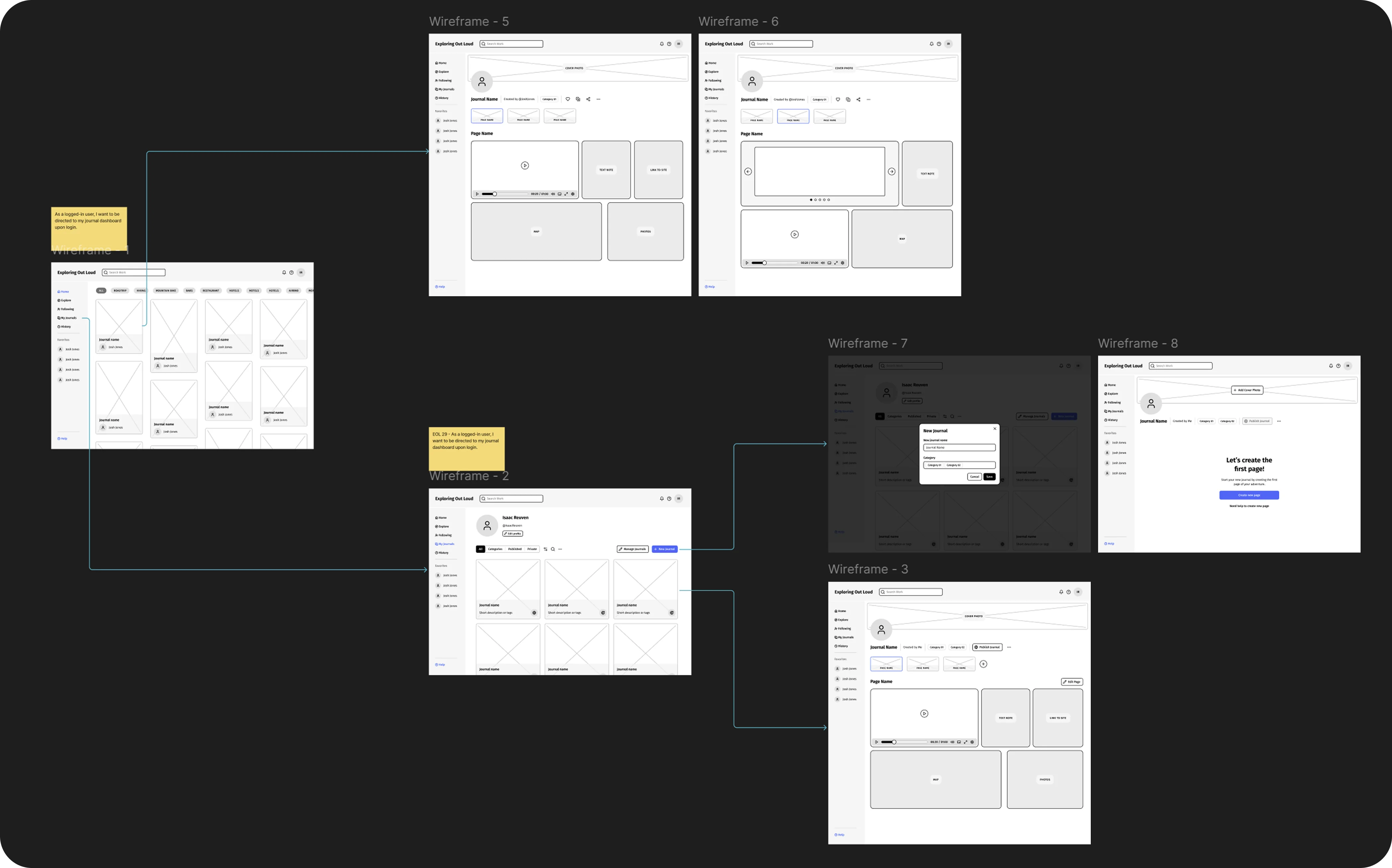
I ran a MoSCoW pass with the client, then plotted every floated feature on a value-versus-effort matrix to make the trade-offs concrete rather than a matter of opinion. An AI customer service bot and an in-app shop both landed in high-effort, low-value territory and were cut outright. Comment and liking systems got flagged “not part of MVP, needs more discussion,” pending a decision on content moderation we weren't ready to own in three weeks. What survived into “must have” was blunt: save a post, publish or unpublish it, add content modules, work offline.
ship in the poc
- save, publish, unpublish a post
- add content modules to an entry
- offline mode
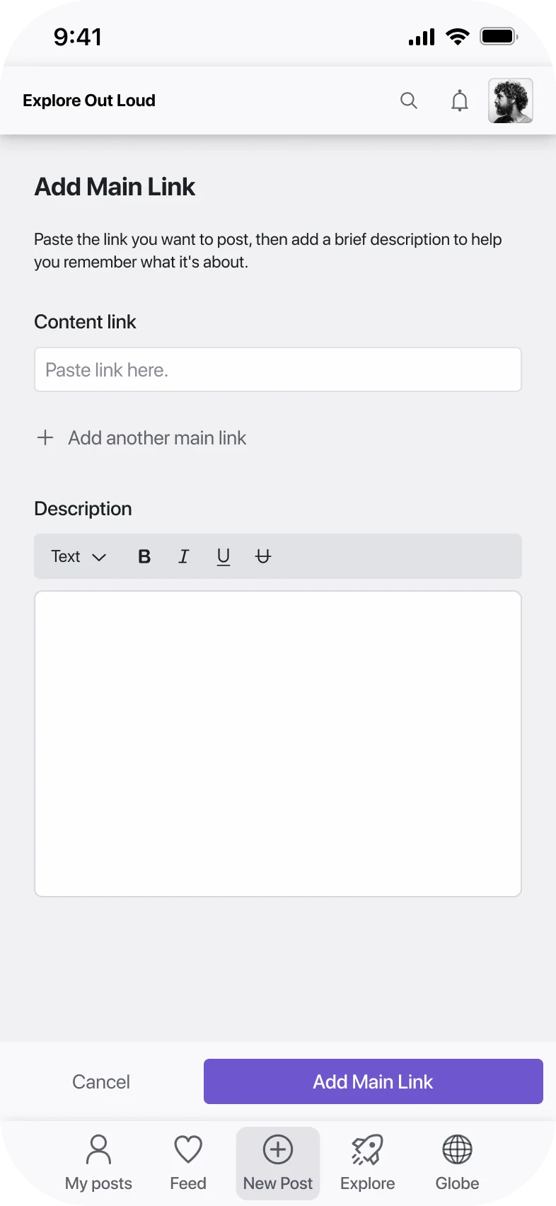
- modular "add thing" flow, video/photo/map/link
- semi-fixed layout, map right, main link top
- basic durable link from youtube
plan for next phase
- comments and likes, pending moderation call
- share-to-app from other platforms
- auto-extract location from a linked trail
- granular privacy controls
- per-module notes
nice to have, revisit later
- general long-text notes box
- gear and affiliate link lists
- templates for non-outdoor categories
cut
- ai customer service bot
- in-app shop
- full drag-and-drop custom layout
- deep third-party app integrations
- meetup and dating-style discovery
ship in the poc
- save, publish, unpublish a post
- add content modules to an entry
- offline mode
- modular "add thing" flow, video/photo/map/link
- semi-fixed layout, map right, main link top
- basic durable link from youtube
plan for next phase
- comments and likes, pending moderation call
- share-to-app from other platforms
- auto-extract location from a linked trail
- granular privacy controls
- per-module notes
nice to have, revisit later
- general long-text notes box
- gear and affiliate link lists
- templates for non-outdoor categories
cut
- ai customer service bot
- in-app shop
- full drag-and-drop custom layout
- deep third-party app integrations
- meetup and dating-style discovery
For the component library, I chose Radix over Tailwind, the more common choice, because Radix let us customize components closer to the client's emerging brand identity and had stronger accessibility defaults at the time. That meant more setup work up front for a 3-week timeline, in exchange for less rework later on brand and accessibility. I also deliberately deprioritized visual polish: the POC used a minimally refined interface on purpose, to validate flows and value proposition, not to ship something beautiful.
Outcome
I ran structured usability tests with scripted tasks and clickable prototypes, using real contacts from the client's network, professional acquaintances, not close friends. I was the only product and design professional on the project, so I ran every session myself.
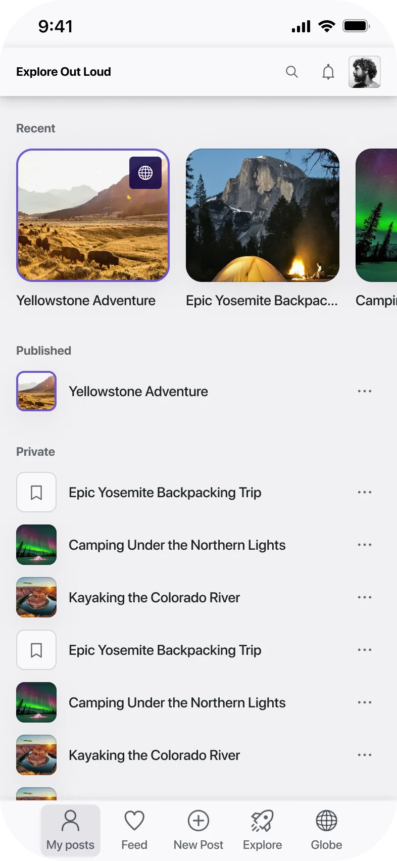
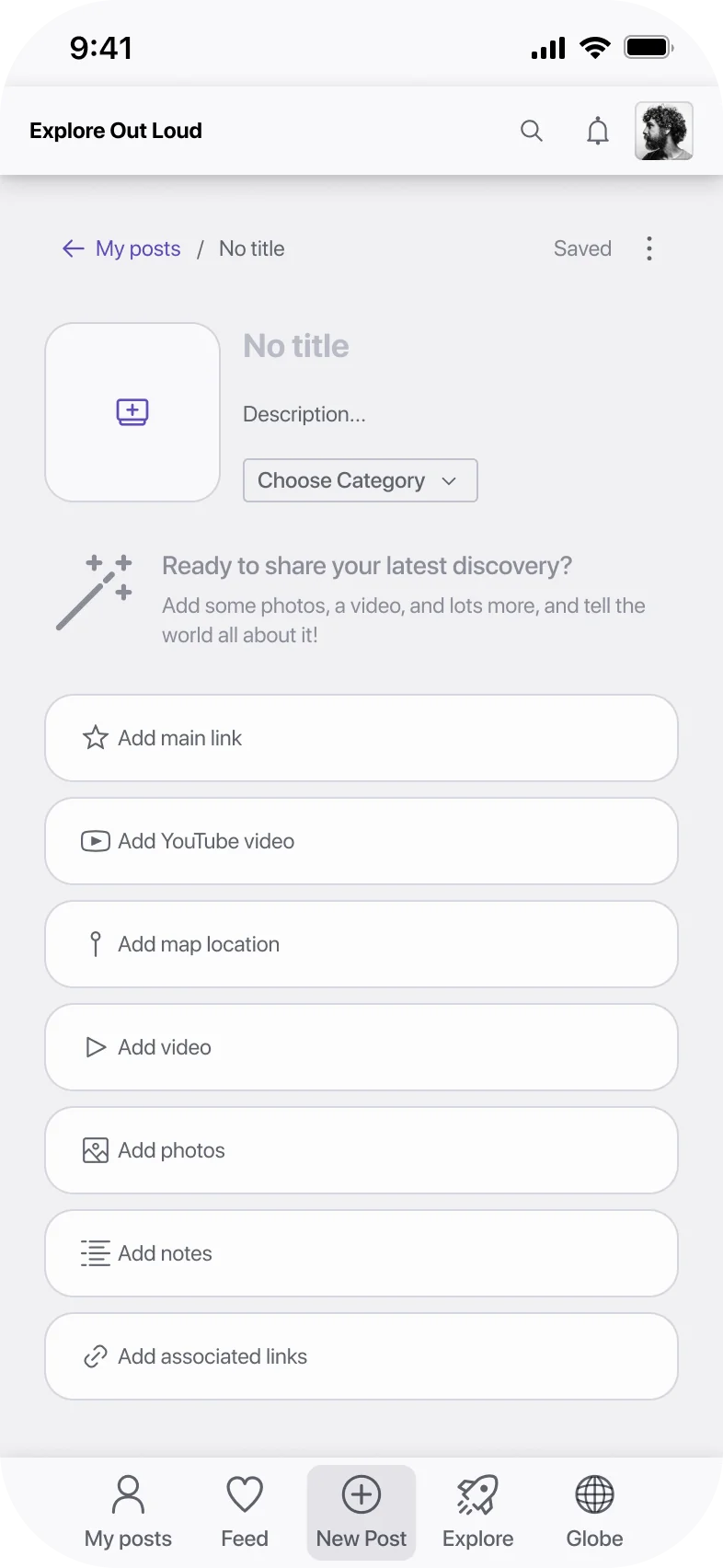
The POC shipped in 3 weeks against a typical 2-month timeline for comparable builds, driven mainly by AI-accelerated research and synthesis, using ChatGPT and Gemini, including Deep Research, throughout: market research, organizing interview notes, drafting the persona, stress-testing my own assumptions, run through both tools and cross-checked to catch discrepancies. This was roughly two years before AI research tools became standard practice, so the workflow itself was part of what made the timeline possible.
Wearing many hats
The MoSCoW and value/effort work became the backbone of the roadmap I handed off going into the MVP phase, along with rough resourcing estimates for the first release.
Feature satisfaction reported by the same testers
POC delivered, against a typical ~2-month timeline for comparable builds
Driven mainly by AI-accelerated research and synthesis, roughly two years before AI research tools became standard practice.
In hindsight
I'd have cut the MVP scope further. We spent real time thinking through features that would add long-term value to the platform, when the sharper move would have been to ship only what solved the user's immediate problem and get it in front of the market faster. A smaller MVP gets a market signal sooner, and that signal tells you whether to keep building or rethink the value proposition entirely. We had the discipline to cut scope with the MoSCoW and value/effort work, I just think the bar for “must have” should have been higher.