Built for Experts
From Explore to Overview: Designing the Entry Point for an OT Security Platform
Designing the entry point for an OT security platform, where density read as more credible than a quiet dashboard.
- Role
- Product Designer, embedded via design agency (Uitify)
- Timeline
- ~1 week discovery, ~2 weeks hands-on design to dev handoff
- Team
- Sole designer; validated directly with Frenos's own security SMEs
- Domain
- OT/ICS security — simulated penetration testing for industrial control systems
Overview
Frenos's team had all worked in cybersecurity for years before building the company together, so every stakeholder had strong, informed opinions about what a security analyst needs to see. The project arrived already named Explore: one dense backlog of every KPI the team believed mattered. My job wasn't to build expertise from zero, it was to cut through expert opinion.
Problem
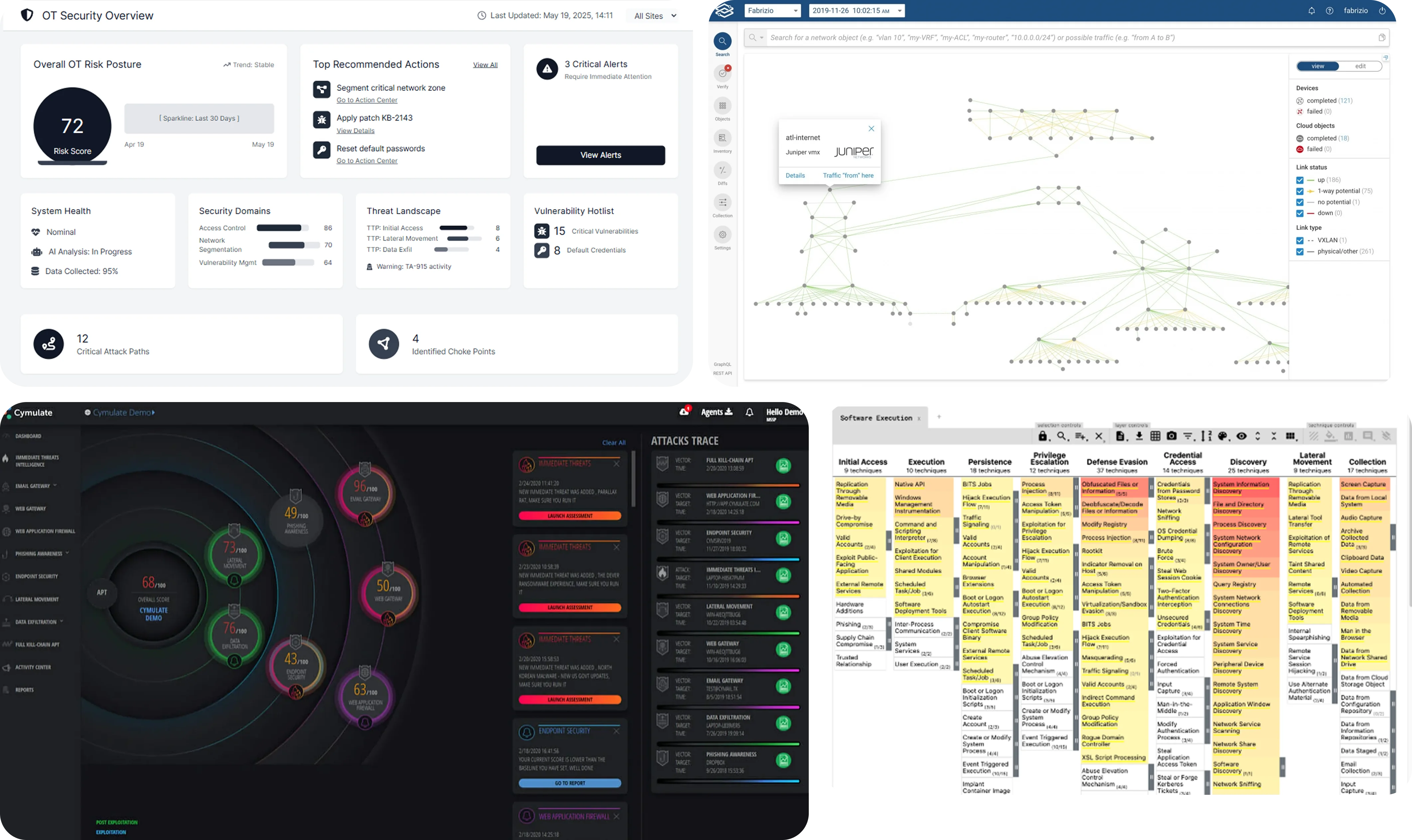
The brief was a big backlog of KPIs and indicators for the platform's entry screen, built around an ICS Security Architect persona, someone who holds situational awareness over a whole industrial network and needs to know where to focus attention first. I already knew that persona from an earlier project with the same client. What I didn't know yet was what this specific screen needed to do for them.
The team believed most of the backlog was necessary. Coming from a different life designing dashboards for complex data analysis in oil and gas, I recognized the shape of this user: someone who opens an overview wanting one thing, which part of the system is most critical right now, so they know where to drill in next. That's a specific job, and it isn't the same job as showing everything at once.
Decision
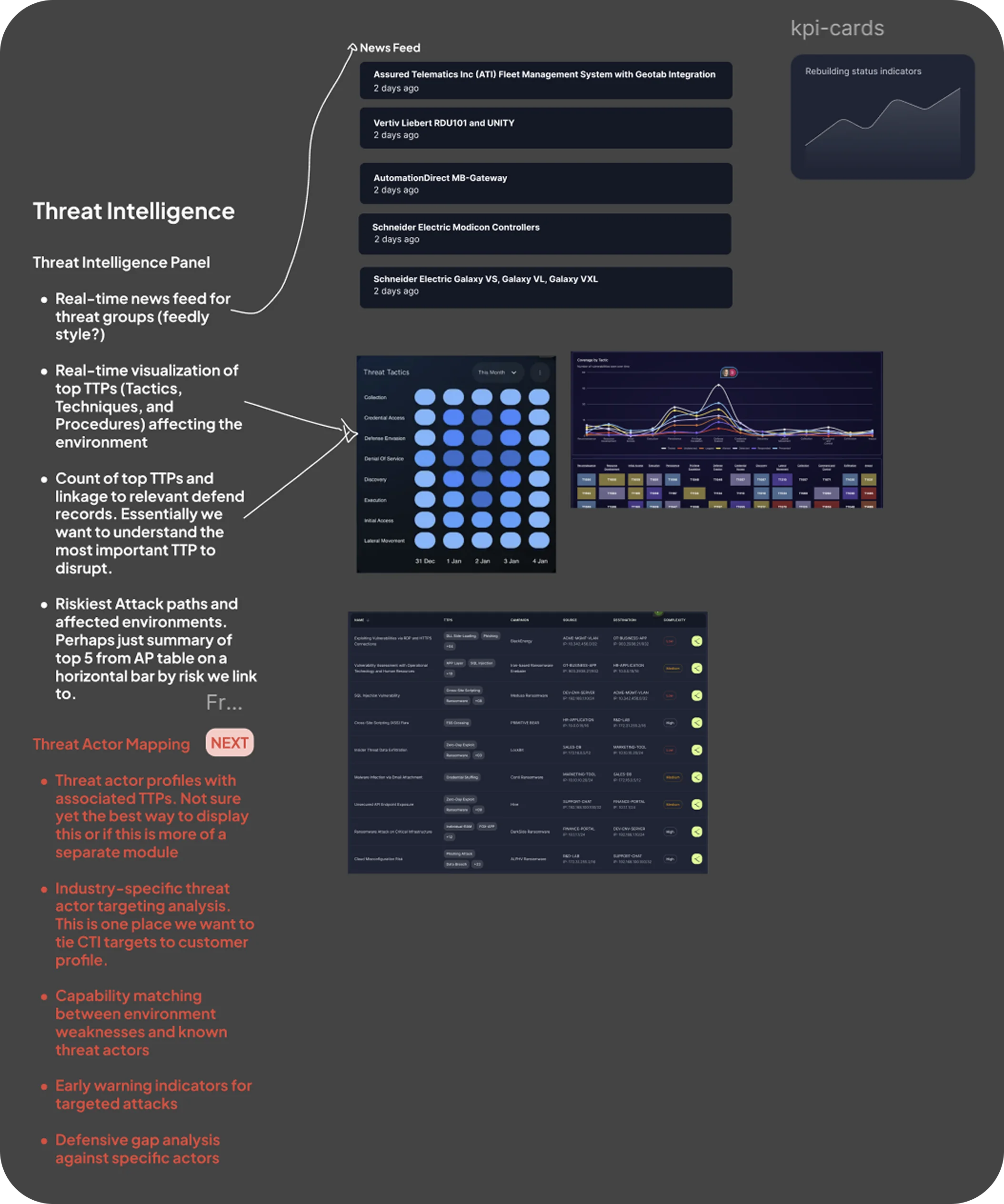
Discovery reshaped scope, not just visuals. Working through the initial objective and user stories with the PM, I pushed on product questions in real time: why does this user need this, what do they do with it, what happens if it isn't here. That conversation, plus evidence from past research on this account, let me deprioritize a chunk of the original KPI list with data, not opinion.
One structural decision came from the team, not from me: structuring the threat activity view around the MITRE ATT&CK framework, tactics across the top, techniques underneath. What I owned was the visualization. MITRE ATT&CK is dense by design, built for deep analysis, not a glanceable summary. I designed a simplified heatmap version instead, a compact grid where color intensity flags where problems are concentrated, with full framework detail available on hover and click, so the user could spot the hot zone first, then choose to go deep.

Trade-off
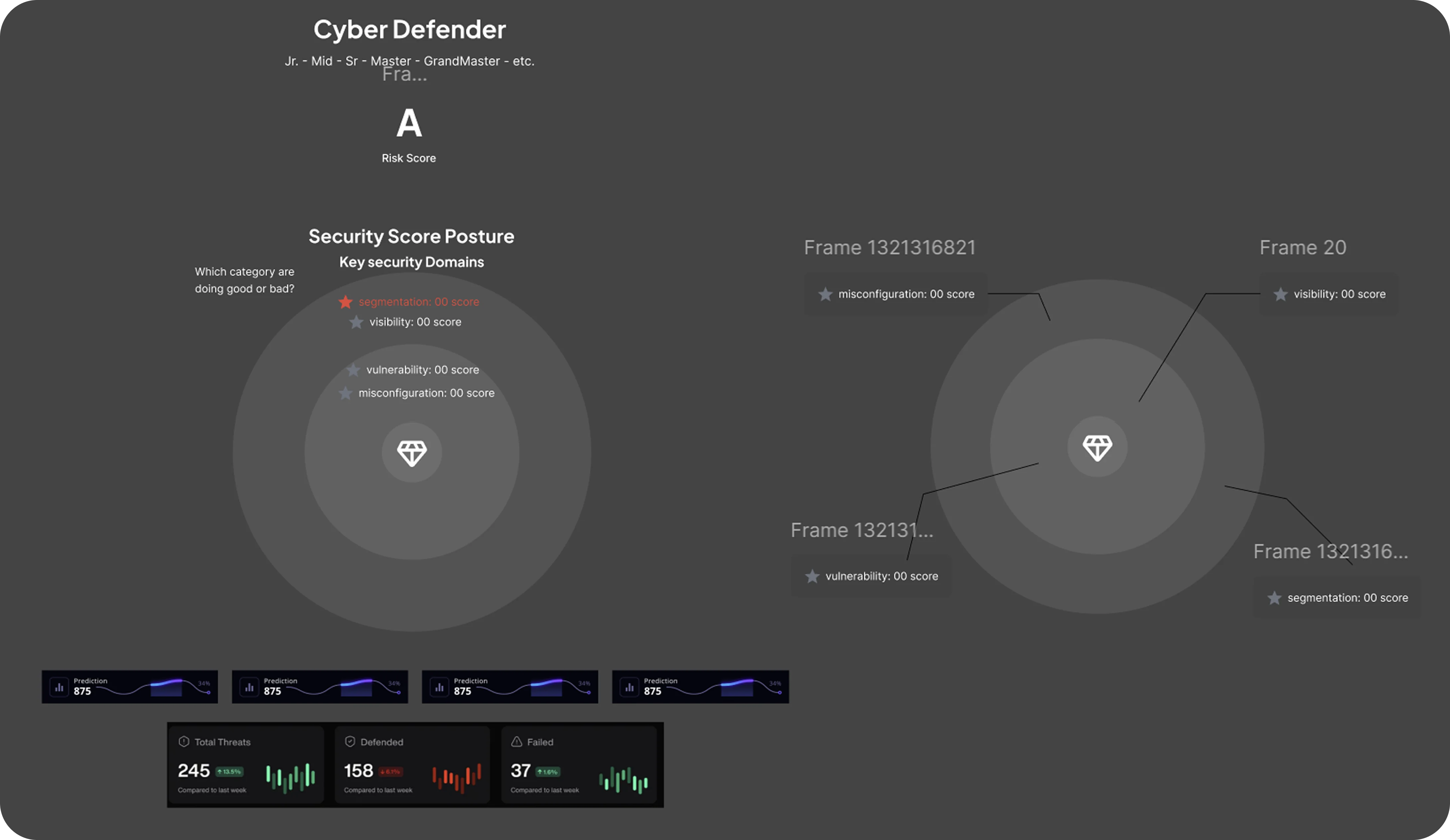
I pushed hard for a security rank system early on, a name (Sage) and tiered badges (C, B, A, S) reflecting platform health. Research on this user base backed it: people in cybersecurity and data analysis skew toward liking game mechanics. The CEO liked it, and it didn't fail in internal testing, but it got deprioritized because we hadn't landed on the right naming or visual language for the tiers, and shipping fast mattered more than solving that properly in this round.
Before
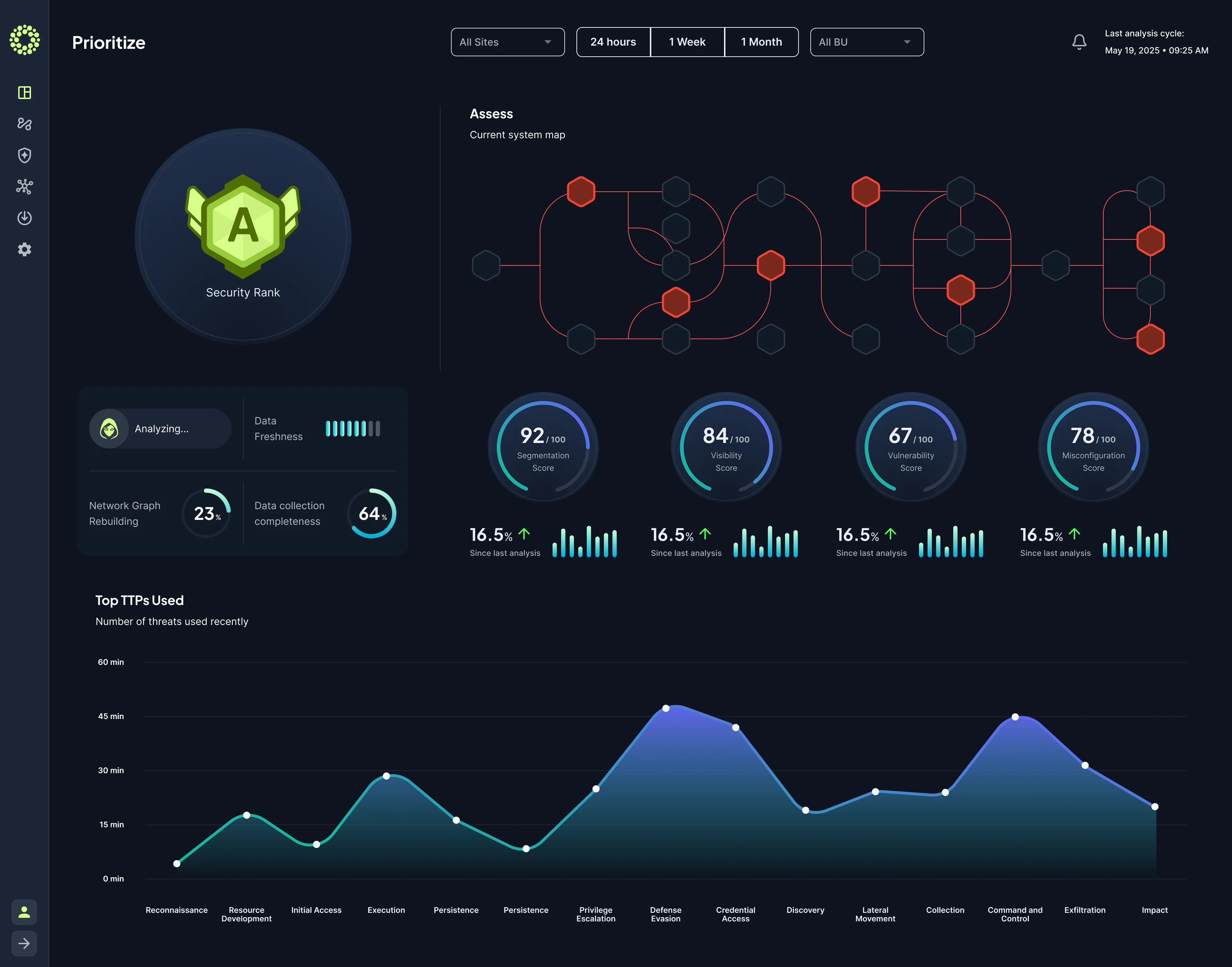
A full rank system: a named tier set (Sage) with four elaborate badge levels, C, B, A, S, each more visually developed than the last.
After
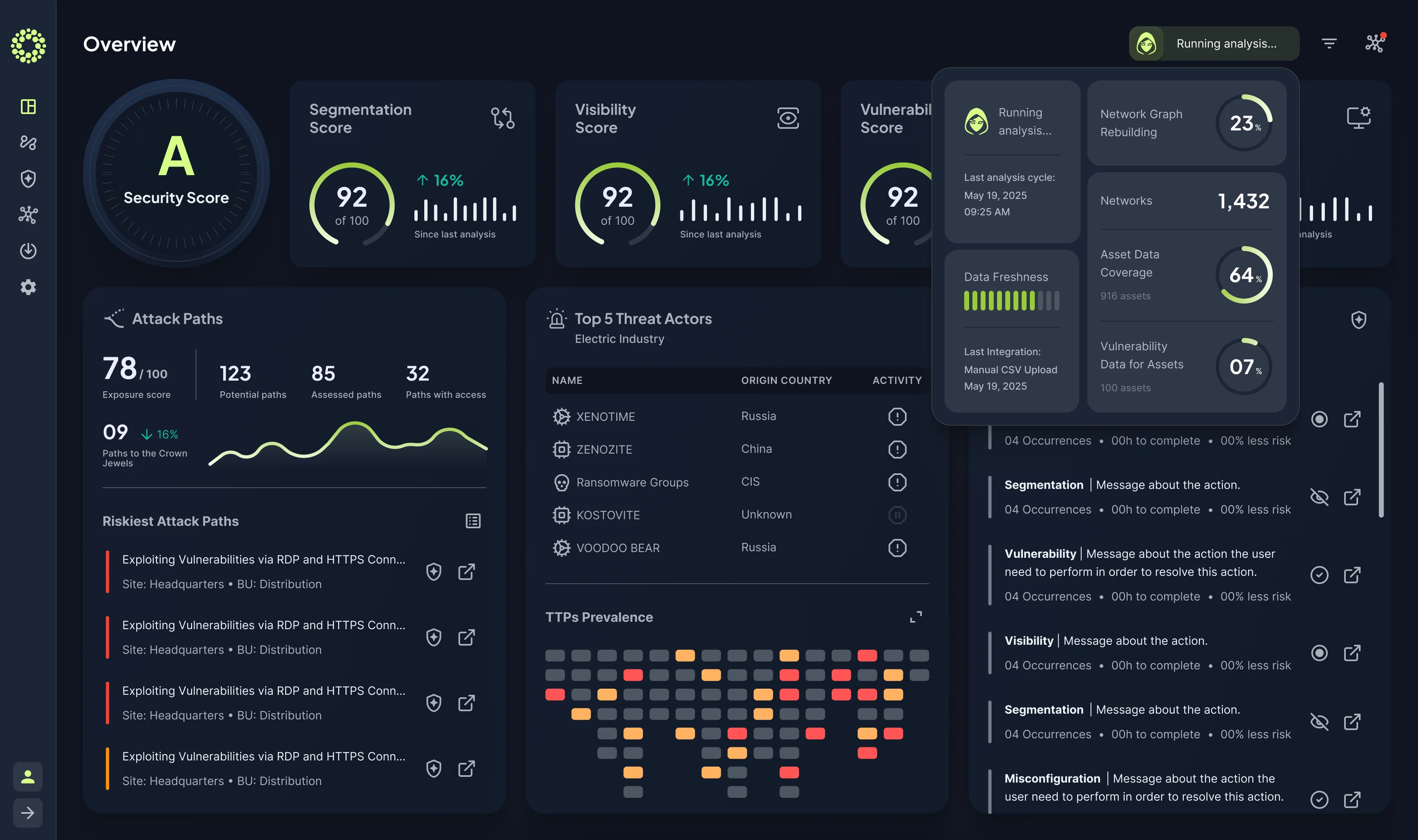
A single letter grade. No name, no badge art. Same fast read on status, none of the risk of reading as gimmicky to an enterprise buyer, and much faster to build.
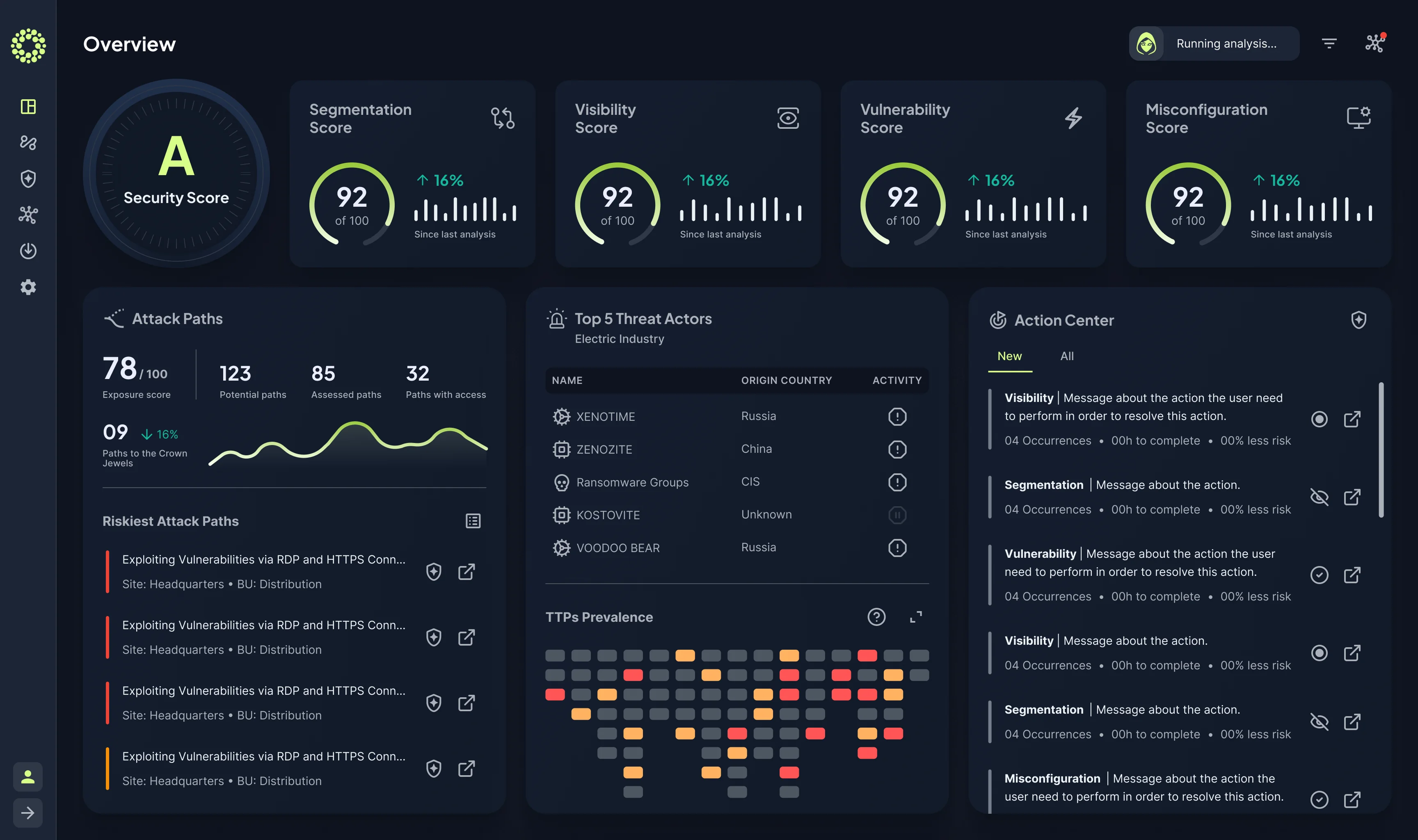
I made a similar deliberate call on density. The finished Overview screen holds four scores, attack path counts, a top-five threat actor list, an action center, and the ATT&CK heatmap, all on one screen. I brought the color palette down from where it started, but this still isn't a quiet, minimal dashboard by conventional design wisdom. Users in this domain expect density; interfaces that strip it down too far read as less credible to this audience, a pattern I'd seen before in oil and gas data tooling.
Outcome
I delivered a dev-ready version in about two weeks, fully validated with the technical side of the team. The CEO liked it enough to ask for the wireframe to go live on Frenos's public website the next day, as a preview of what was coming, and it stayed up until engineering finished the real build. The gap between what shipped on the site and what eventually went to production was mostly copy and label adjustments; the architecture and color system held.
I learned about the site placement in one of Frenos's internal product meetings, itself worth noting, since I was an external agency designer who'd built enough trust to be included in strategic product discussions, to the point of signing a separate NDA to be in the room.
Business impact
Hands-on design time to dev-ready handoff
Plus a short discovery week before it. Still fully hand-built work, before AI interface generation was good enough to speed up that part.
Enterprise prospects who cited the public preview before becoming paying clients
Reported secondhand by the product manager, not a metric I tracked myself. Their deal cycle ran on Frenos's normal ~1-month timeline, not faster than usual.
A note on timing
This was one of the last projects I built almost entirely by hand, every pixel, every vector, every component, before AI-assisted interface generation tools were good enough to meaningfully speed that part up. I was already using AI heavily for research and for getting up to speed on the cybersecurity domain fast enough to speak the language of my users and stakeholders. The interface work itself was still a fully manual craft process at this point, part of why the two-week turnaround stood out to the client as fast.